As a company, VideoTranslator has evolved, learned, and grown over the past several years. With these changes in mind, we think it is also time to do some transformations with our branding.
Background
We started the company, QBL Media, all the way back in 2014. However, work only started in 2017. The app which would become the current VideoTranslator App was started in 2018.
By 2019, we soft-launched the app. Over the next 3 years, our VideoTranslator app got over 10,000 signed-up users, and hundreds of hours of video content transcribed, translated and dubbed - note, including both our efforts and clients who used the app.
Internally, we went from a single founder and outsourced developer in India to a 5 man team across Australia and India. We went from being a single room in a client’s office to having our own little 4 desk setup.
Earlier this year, we started working on a new version of the app. This process made us realize that we did not have a clear brand guideline that defined our visual style and who we are as an AI company.
Our Original Branding
Originally, this is the logo that we used for our branding.

It is a mixture of a human and a robot - in line with our vision that an AI is not there to replace humans but rather to make our jobs easier. The font we mainly use is Montserrat.
Other than that, there wasn’t really a standardise brand styling that we used.
VideoTranslatorAI’s New Branding
Around the second quarter of the year, we contacted a very talented designer, Jasmine Lo, to redesign our logo and other visual elements. With Jasmine’s help, we were able to redefine our brand identity.
Our brand identity
Our mission: Using language to reach a wider audience.
Our vision: Using AI to supercharge content marketing.
Our tagline: Speak and be heard - We believe that it does not matter what language you speak. As long as you speak, your voice and message will be heard by many.
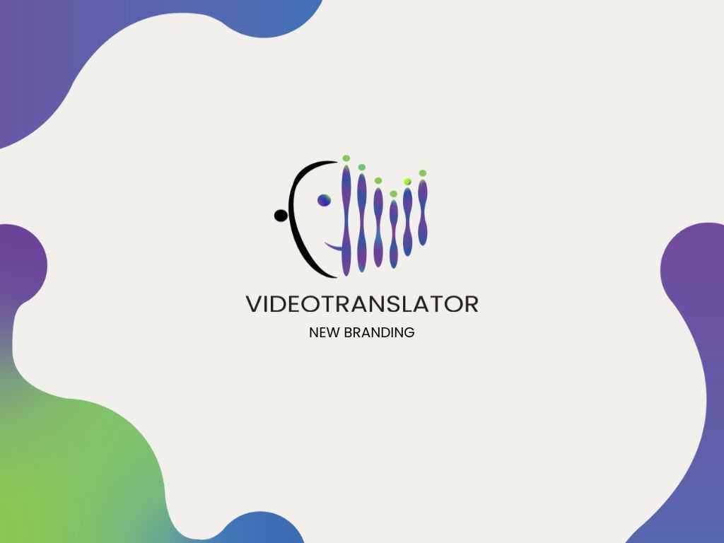
VideoTranslatorAI’s new logo
As we mentioned earlier, our previous logo is a mixture of a human and a robot. After redefining our brand identity, we moved on to redesigning our old logo.
In total, Jasmine made around 11 sketches of our new logo. There were a couple that we really like, but we ended up choosing this one!

In relation to our brand identity, our logo has these meanings:
- It is a stylised rendition of our old logo, merged with sound waves instead.
- Each person (users) is represented by the circle on the sound wave.
- We aim to show that even though each soundwave is different, the integration of our AI translation will work hand in hand with the soundwaves and be seen by many.
Our brand style
To make a more standardised brand styling, Jasmine also helped us create the following:
Brand identity colours
Offwhite - general base colour
Purple - inspires wisdom, promotes enlightenment, triggers creativity, sense of familiarity with the brand.
Blue - inspires trust, suggests precision, and trustworthiness.
Green - promotes growth, encouraging, a sense of familiarity with the brand.

Identity typeface
Previously, we used the font Montserrat for our branding. After Jasmine’s rendition, we are now using Poppins as our typeface.
Brand graphics
We hope to connect with people through a simple translation. The circles are meant to represent the people we aim to touch.

Conclusion
Massive shoutout to Jasmine for making all these happen!
What do you think of our new branding?
For more information about us, don’t hesitate to contact us at hello@videotranslator.ai.


